


Everyone has a 404 page, even if you don't know it. A 404 page is an error message indicating that the web page you want to visit no longer exists or never did. The page may have been permanently moved or deleted. It could also be that the visitor typed in a wrong URL or... in the case of a webshop, that the product is no longer available.
End of story. Visitor gone.
But what if that page is actually an opportunity? A moment to showcase your brand, build trust, and guide that visitor to a logical next step?
How a 404 page actually works
A 404 error message appears when someone lands on a URL that doesn't exist. This can happen because you deleted a product, a blog post got a different URL, or because someone simply made a typo.
In webshops, this happens more often than you'd think. Products sell out or are removed from the assortment. Categories change. Links from old newsletters or social media no longer work. And every time a visitor clicks on such a dead link, that 404 page appears.
The standard system page of almost every platform is functional but does absolutely nothing for your brand. No recognition, no direction, no reason to stay. That's a shame, because someone who lands on your webshop was looking for something.
The true cost of a bad 404 page
Let's be honest: a visitor who lands on a 404 page is not happy. That person wanted to see something that isn't there. That is by definition a disappointment.
But disappointment doesn't have to be the end of the conversation.
If your 404 page is just a dead end, your visitor will click away. You'll see that reflected in your bounce rate, but what you don't see is the missed opportunity. That person might have wanted to buy something else. Might have wanted to sign up for your newsletter. Or was simply curious about your brand.
A bad 404 page says: this is where it stops, too bad. A good 404 page says: come on, I'll help you further.
What a strong 404 page does
An effective 404 page combines three things: brand personality, clear navigation, and conversion opportunities. Not all shouting at once, but cleverly intertwined.
Showcasing brand personality
This is one of the few places where you can literally say "oops, something went wrong" and do something fun with it. Humor works well, as long as it fits your brand. A webshop with a playful tone of voice can certainly put something funny here. A premium brand keeps it sleek but warm.
The point is: show your brand. A lost visitor can still get a positive impression of you. That impression will stick, even if they don't buy anything right now.
Offering clear routes
A lost visitor wants direction. Give it. Not with twenty links, but with a few logical options. Think of a link to your shop, to your best-selling products, to your collections. One choice is too few, ten choices is too many. Three to five targeted links work best.
A search function is also valuable here. Some visitors know exactly what they're looking for, they just typed the wrong URL. Let them search without hassle.
Not missing conversion opportunities
This is the moment to offer something. Not aggressively, but present. Think of a discount code to soften the disappointment. Or a link to your newsletter with a catchy text. Or your newest products, presented as "you might have been looking for this".
It's not about hard sales, it's about relevance. Someone who lands on a dead product page might be interested in similar products. Show them.
Practical elements for your 404 page
If you want to make this concrete, consider the following elements:
- A custom visual that matches your branding. This can be an illustration, a photo, or just a sleek typographic solution. As long as it doesn't look like a system error.
- A text that sets the tone. Something like "Hmm, this page doesn't exist (anymore). But we're happy to help you further." Short, warm, and directly followed by options.
- Three to five targeted links. To your homepage, your shop, your collections, your about page. Choose what makes sense for your target audience.
- A search bar. Simple, but effective.
- Your social media links. While you're at it. Not prominent, but present.
- A conversion element. A discount code, a newsletter opt-in, or a selection of products. Choose one and do it well.
- Extra 404 conversion tips
Examples that work
Some brands have understood this principle for years. Vans shows a lost shoe, fitting their product and humor. ASOS keeps it clean and functional with clear navigation. Benefit Cosmetics combines humor with direct product advice: their best-selling items are right there.
The difference between these pages and a standard 404 is that they don't make you feel like you've done something wrong. They invite you to look further.
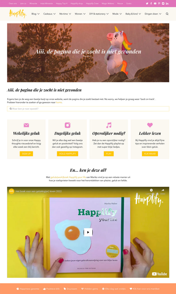
This is Happlify's 404 page. This website was built with Shopify and you can also create a custom 404 page with it.


The 404 page as part of your brand experience
Ultimately, this isn't about one page. It's about consistency. A visitor who comes to your webshop should have the same brand experience on every page. Even on pages where something goes wrong.
Strong brands are recognizable in every point of contact. Also in error messages. Especially there, in fact, because at that moment expectations are low. A positive surprise sticks.
Your 404 page is a small investment with potentially big impact. Not because it doubles your sales, but because it shows that you think about every detail. And that's exactly what distinguishes a webshop from a brand.
In conclusion
A 404 page doesn't have to be a dead end. With the right attention, it becomes an unexpectedly strong brand page. One that doesn't drive visitors away, but helps them further. That shows your personality. And that might even convert.
The question isn't whether your visitors will ever land on your 404 page. It will happen. The question is what they find there.
🔥 A strong 404 page is a standard component of every webshop we build. Just like thoughtful navigation, conversion-oriented product pages, and a correct checkout. Curious about how we approach webshops? Check out our Shopify webshop development


