A 404 page, everyone has one, even without you knowing it. A 404 page is an error message that indicates that the web page you want to visit no longer exists. The page may be permanently moved or deleted. It is also possible that the visitor has entered a wrong URL or… in the case of a webshop, that the product is no longer available.
Why a 404 page?
But why pay attention to a custom 404? Because if it's just a blank page with a simple error message - often with silly system generated text like “Error message. Unfortunately the page you are looking for cannot be found. The page may have been changed or removed. Sorry for the inconvenience." - *click* is your visitor away and therefore also that potential customer. Boom, bounce rate up. Eternal sin! You can really get a lot more out of that, even conversion! How?
To ease the pain
The 404 page becomes interesting by customizing it. Ok, but… what can you do with it and what do you put on it? That can be a lot. We ourselves love a decorated 404 with a bit of humor to ease the 'pain' of not finding it. Because, let's face it, the visitor wanted to see something specific on your website or webshop and is now empty-handed. So you have to give him/her an alternative to (at least) stay.
What do you put on such a page as a webshop?
Over the years we have made many custom 404s for our former webshop Applepiepieces. Unfortunately, not all of them have been preserved, but we still apply the content exactly the same to our customers, where possible and to ourselves of course. You can keep it very clean of course (see different approaches below), but you could put all of this on it. Here are some smart 404 page tips that are not only fun, but also definitely increase conversions over a dead normal 404:
- come up with a nice visual that fits the branding of your webshop
- write an ' oops text ' with something like (in your own words) “Bummer. You didn't find what you were looking for. That can happen of course, but we are happy to help you.” With this you don't close something but you open the doors for more
- then post a list of useful links that can help the stuck (potential!!) customer. Such as a link to your opt-in (mailing list registration form), to the shop, to about , to your blog ... what you find relevant or what you think your visitor who is in the wrong place is looking for
- If you have the opportunity I would also put a search field so that you can also search for what is 'lost'
- maybe also the links to your social media accounts. While you're at it
- and in the end, there's something nice in it. Something fun , a kind of 'easter egg', for example a movie
Additional 404 conversion tips
Do you want to make the page converting? Here are two more tips that will help you with that:
- then apologize for the inconvenience (make up a nice text for this) and give a discount code for example
- put products on the site, for example the newest (along the lines of “you may be 'wrong', but these are our newest products :-)”
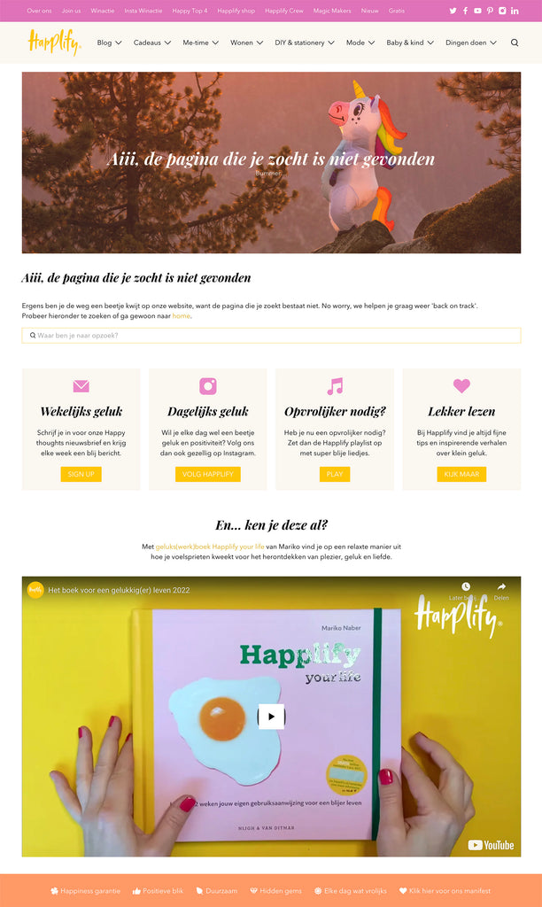
This is the 404 page of Happlify. This website was created with Shopify and also with that you can create a custom 404 page.

Could you use more of these tips?
Then sign up for the Awesome Tips ! This is now a blog post to which the tip refers, but content is also shared that is only distributed by email.
Below are a few more great examples of good 404 pages. Of course I hope I have inspired and convinced you to make a good 404 yourself. In any case, it's definitely worth it!
Well thought out in relation to the product being sold. Like!

ASOS keeps it nice and simple and clear.

Free people has dressed it up a bit more, but remains to the point.

This one from Benefit is my favorite! Humor, clarity and immediately showing the 'Best-selling products'!

And? Are you going to get started with your 404 error page?


